Logo Development for Body Alive
A little look behind the scene that shows how this logo was created.
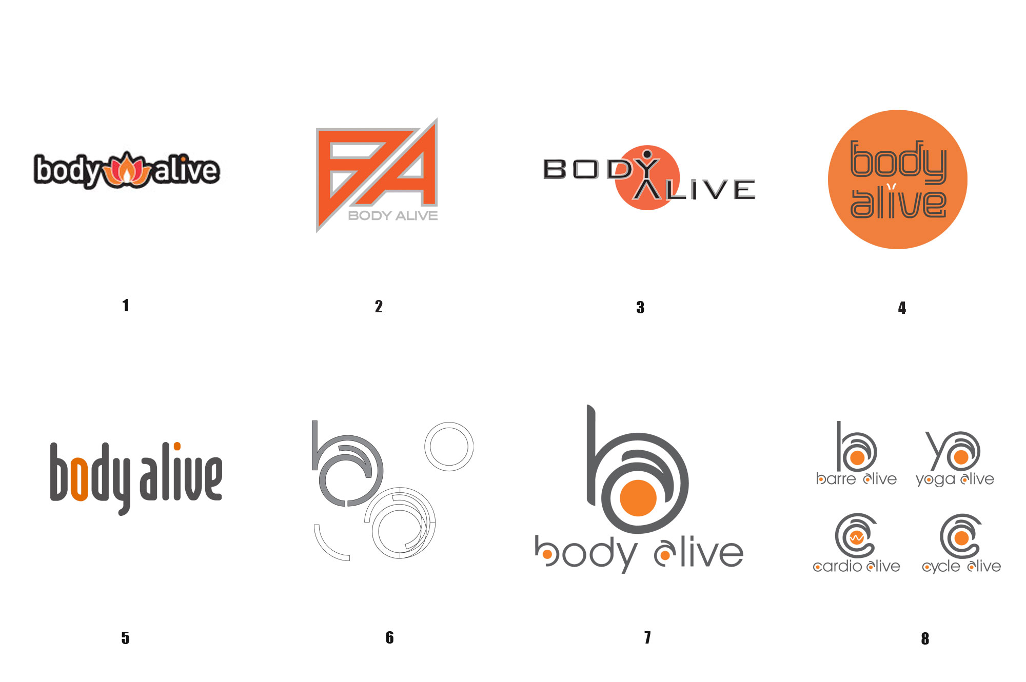
To Cincinnati fitness studio “Body Alive” outgrew it’s original set up as a yoga studio. An expansion to offer more high energy fitness classes had already happened, but the original logo still said: we are a yoga studio (1). The outdated, over-used lotus needed to go, the orange/black color scheme needed to stay. The staff wanted a more dynamic look, reflecting the new direction. The first idea (2) was strong, but too masculine for a studio where more than 75% of the members are female. The second concept (3) was more playful, I still love it, but the type was still too angular. The focus shifted to trying different type in round 4 and 5. This led finally to constructing a custom type face (6) that could be “cut and glued” to build the final logo (7) as well as multiple logo’s for the different types of classes being offered. (8)
Gran articulo, amigo mio, buen analisis a tener en cuenta para la generacion actual y las futuras. Woodrow Szymczyk
Some really nice and useful info on this site, as well I think the design has got wonderful features. Nickolas Kaza
Way cool! Some extremely valid points! I appreciate you writing this write-up plus the rest of the site is really good. Solomon Goan
I value the details on your internet site. Many thanks. Stan Houtkooper